Some Introduction
So, Leopard came out this past Friday, and there have been many, many reviews of all the spiffy new features and how they’ll make you lose 10 lbs, grow your hair back (but lose your back hair), and generally just be the spiffiest thing to come out of the cupertino mother-ship ever since the last major release of their core OS.
I read many of these reviews, and got all excited about getting it installed. Alas, I use several items on my work laptop that are not yet compatible with Leopard (the software company that produces the main chunk of code I have to have working on Leopard claims that it works, but their forums are filled with gripes from daredevil folks willing to have thrown all forms of caution into the stiff breeze and run willy-nilly into a soft, warm embrace with this new OS only to discover that they can’t use it after all, because one of their main productivity tools is just plain jim-busted, so I’m a gonna hafta wait for a few weeks on my work lappie.)
So, I had to hunt around for another victim computer for my first Leopard install.
Hey, what’s that over there? Oh, look! It’s a MacMini that my kids use to play every game on sesamestreet.com. That’ll do.
So, I dragged home my external hard drive (wouldn’t want to lose any high scores from the "Elmo Learns To Go Potty" game) to backup anything I could find of any importance on the mini and got to work.
What follows is my completely unscientific, largely incomplete, mostly griping review of Mac OS X 10.5 – Leopard.
The Dinky Review
I’m not an operating system internals guy. Yes, I do write software for a living, and I do recall a lot from that nasty OS class I had to take in school (writing my own virtual memory manager from scratch was not my idea of a killer way to spend 3 weeks in a CS lab.) Thus, I will not even pretend to comment on the guts of the OS. I’ve heard it’s nifty from lots of geeky types who know, and have decided to take their word for it.
Instead, I’ve decided to tell you about my impressions of how the OS looks. Part of what I have always loved about the MacOS (even back in the days of MacOS 7, when I first started using a mac) was that things were logical, and laid out in ways that just "felt" right. Moving from OS 9 to OS X was a jolt for many folks, because with the advent of the Aqua interface Apple totally broke free from the look and feel that they had used on virtually every macintosh they ever shipped.
In successive iterations of Mac OS X, they have monkeyed with their UI even more – these funky metal windows, pinstripes everywhere, pulsing buttons, drawers, sheets, etc.
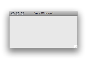
In Leopard, it seems they are attempting to go back to a single style for all windows (with the only exceptions being apps written by apple – i.e., Garage Band). Here’s what a basic window looks like on my mini right now:
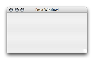
As opposed to the same window running on my 10.4.10 laptop:
Couple of things I notice immediately: The drop shadow is on steroids in Leopard – I mean really guys, the shadows are all spiffy and things, but come on already – I don’t need to have that much of an effect. Secondly – and this may be an optical illusion – I’m too lazy to actually open up photoshop and check – but there appears to be a white border around the inner frame of the Leopard window that is about 1 px wide – makes the transition from the window contents to the title bar jarring.
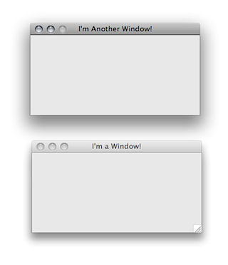
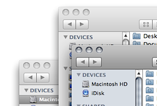
Up next, I noticed that they changed the way that the OS colors the frontmost window. On previous iterations of Mac OS X, the lighter window was the one in front. On Leopard, the darker window is the active one:
Here’s Leopard:
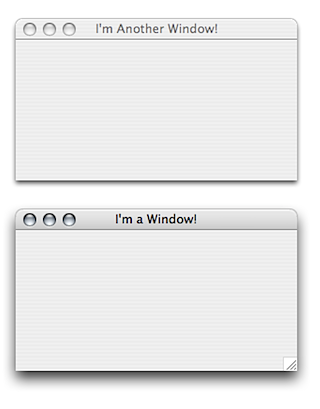
And here’s Tiger:
Hmm.. Now that I look at these shots, I think the thing that really bugs me is that the title bar is just so dark on Leopard. This is probably because it is so prevalent:
So, in short, I don’t really like the new look and feel of the finder and other window frames all that much.
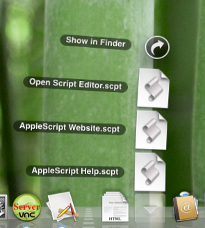
Up next, let’s talk stacks:
This is one feature of Leopard that I do think is pretty spiffy – I’ve not played much with them, and since I don’t really do anything with this particular computer, I may be missing some of the elegance, but I think I’ll grow to like them a lot when I use Leopard full time on my own laptop. It appears that a stack works like this when there are just a few items in the destination folder:
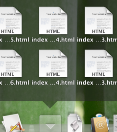
And they look like this when there are a LOT of items in the destination folder:
(There are actually several hundred items in this folder, and not all of them show up on the screen, which will make this feature less useful if you have a folder with a lot of items, all of which you actually need – but if you are in that situation, you have other problems that should probably be mentioned to your therapist.)
Speaking of folders, have you seen the new icons for the folders? I really don’t like them, as they are very hard to identify at a glance due to their 2 color scheme (instead of the very colorful icons from Tiger):
Here’s a list view from a finder window:
and another one:
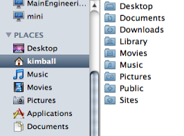
On this one, note the inconsistency between the icons under the "Places" sidebar on the left, and the same folders in the list on the right. It is rare (in my experience) to see Apple vary their look and feel for the same destination in this manner.
For comparison, here is how these icons look in Tiger:
I think the colors really help.
There is not much else that I have really examined in the system – I did set up parental controls, and there seemed to be a problem with it. I set up simple finder for one of my children, then specified a list of about a dozen or so apps that the user could launch. I then logged in as that user, and found only about 3 of the apps actually enabled – I went back into the settings in my account for the parental controls for the user, and re-enabled access to all the apps again. Now it shows 7 or so of the apps available, but not all of them. I have not had time yet to figure out why. Also, I’ve set time limits such that both my kids accounts cannot log in between 8 pm (bedtime) and 7 am. However, when they are logged out for the day, on the login screen it says that one of them can log back in at 7 am the next day (as it should) and the other says it can log in at 12 midnight. Odd, that.
Also, in SystemPreferences, be prepared for a bit of a jolt in trying to find stuff – in particular, network settings looks a lot different, and I have not yet found the firewall settings (though I admit I have not really tried, either….it used to be under the sharing tab, but appears to have headed off for sunnier climes – I’ll have to find it another day).
So, that’s about it for me on this lame review. Bottom line: I don’t think I like the look and feel all that much. Stacks are cool. Where did my firewall go?
UPDATE: Hans wrote in with a comment showing me where the firewall disappeared. Thanks!


Leave a Reply